AS Media Blog

Monday 10 April 2017

Final music magazine evaluation

Q1: In what ways do your media products use, develop or challenge the forms and conventions of real media products?

It is evident that there are many different conventions and house styles present in media products that have already been created. Without these, a magazine would not as professional and would therefore create a smaller income.

During the creation of my front cover, I tried to stick to typical conventions that exist in real media products due to the fact that I know they are successful and allow for a magazine to look professional. This is shown through the fact that I have displayed mastheads in conventional areas, feature artists titles and cover lines in typical places, therefore making my magazine conventional yet well finished. Some of the other conventions are as follows:

- Masthead positioned at the top of the page

- Issue date

- Dominating background photograph with the feature artists body position clearly visible

- Cover lines positioned on the side of the page and at the bottom

- Different yet appropriate fonts and sizes

- Page numbers in bottom corners

I analysed magazines such as Billboard to gather inspiration for my cover page. This is because I admire the simplistic yet effective conventions and house styles that are utilised. This magazine also includes genre of music that are similar to that in my music magazine, therefore making these conventions, and perhaps the contents of the magazine itself more appropriate in my project.

It is also clear that conventions and house styles are also used in contents pages of magazines, also for the purpose of professionalism. A well designed contents page will entice the reader to the magazine whilst maintaining a style that is simplistic enough to allow for easy navigation.

During the creation process of my contents page, I decided to challenge the conventions created by Billboard magazine in their contents page, as I believed that they are over-complicated. Instead, I opted for a more simplistic style, with a large image in the background, complete with the contents themselves positioned down the left hand side of the page. This is different to a typical Billboard contents page as those are usually separated into blocks. This therefore proves that I have challenged conventions created by Billboard magazine.

Lastly, it is obvious that DPS's follow key conventions. These are as follows:

- Image dominated (feature artists) complete with a pull quote related to the image in question

- An article that will most likely be related to the image

I believe that I have developed these conventions as I have taken these aspects and arranged the DPS into sections. One of the sections is the artists name complete with a pull quote, another section was the article, and the final section was the image of the artist in question.

Overall

I made these decisions because I wanted final products that did not differentiate too far from the conventions that were created by magazines that I took inspiration from, whilst maintaining an enticing yet professional style. I have ensured that these aspects are consistent throughout the work that I have produced.

The final outcome and effect is a number of products that are unique, however it is evident that key conventions were followed. This has allowed for products that are enticing for potential readers whilst maintaining a good standard of professionalism.

I think the creation of my final products went well as I believe they are of good standard. In my, opinion I have improved since the start of this course and I now feel that I am more than capable of creating such products.

Q2: How does your media product represent social groups?

There are many different social groups present that media products are adapted to follow. Some of these include age, gender and potential occupation.

Throughout my front cover, contents page and DPS, I have attempted to target a late teen/young adult audience that can be male or female. Their potential occupation does not have a role in my products. I have targeted this audience through my house styles and page furniture, in the hope that this will entice the potential reader to my magazine. Therefore, over time, increasing sales and profit figures, which is good from a business perspective. I have chosen to do this because I fit into this audience myself. At the time of this evaluation, I am a 17 year old male, who listens to both Rap music and EDM music, which are the two genres in my magazine.

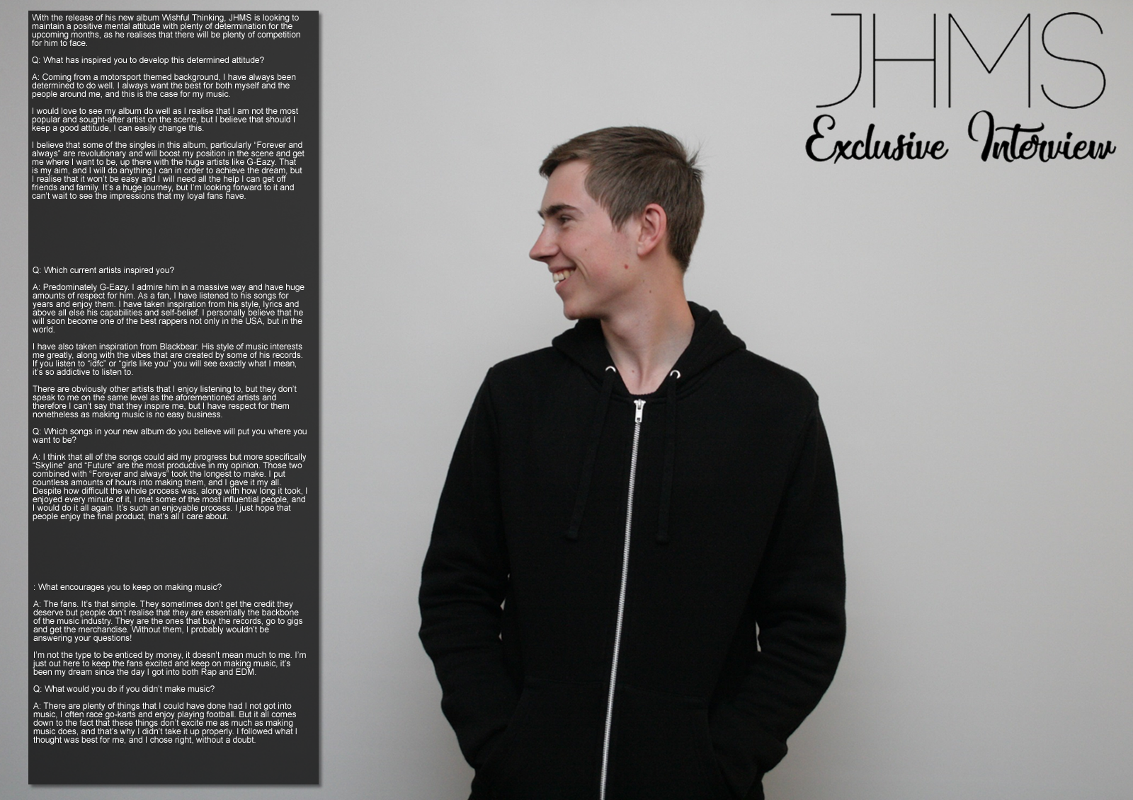
Most of the photography, lighting, mise-en-scene, location, body language, facial expressions, costume, hair and make-up etc. Is kept to a simplistic style, with most of the photos being taken on a white background, with typical clothes being worn and with no hair or make-up factors being out of the ordinary. This, along with the page furniture and house styles, allows for a serious yet effective style, which was my initial idea for my music magazine.

Q3: What kind of media institution might distribute your media product and why?

I would use Lynne Segal to publish my product due to the fact that she publishes Billboard magazine, which is one that I have taken inspiration from during the creation of my products. She also publishes The Hollywood reporter, which proves that Lynne Segal is capable of publishing big names in this industry. This would help my magazine as this is obviously a well respected reporter that could perhaps boost the ratings and awareness of my magazine, which is also positive from a business perspective. I fit in with their institution because I have produced a magazine that is of the similar style as one that is currently being produced by this publisher, meaning that it fits in with the publisher’s readership and ideologies. Finally, I would produce my magazine on websites and on print to target two audiences at the same time, as this will result in as many people as possible reading my magazine.

Q4: Who would be the audience for my media product?

My magazine is appealing to people who listen to Rap and EDM music. This includes artists such as G-Eazy, The Weeknd, XYConstant and Sofi De La Torre. The people who interact with these artists may also take inspiration from the clothes that they wear and the products that they buy.

My magazine targets people who are in their late teens or early adulthood, which is for the most part, C2, D and E on the JINCAR scale. Both genders are being targeted equally, as many males like such music as do females. Such people are into similar clothing styles than those of the artists, which can sometimes be found in fashion magazines. There is also no specific class and status measurement as all levels are being equally targeted. Most of these people use a variety of social media, which could be an incentive to create a social media page for the business.

My questionnaire also identified this, with key questions being answered with the same results. This holds significance as it backs up my previous statement regarding the typical audience.

Q5:What did you do to attract/address your audience?

This will be uploaded in another post. This will follow this post.

Audience interviews

Person 1 views- I find these final products very attractive and I feel that they address the audience well. They are suited well to the types of music that are included in the magazine and are therefore of a high standard. To improve however, I would add more colour to the magazine as I feel that it is bland in the current state. This could also make the magazine more appealing, which would result in more sales.

Person 2 views- I personally do not find the characterists of this magazine appealing as I do not feel as if there is enough colour in the magazine and the features could be placed in better areas. I do however admire the fact that a model was used that takes a genuine interest in the music featured, as does the creator of the magazine. This has allowed for a product of higher quality as the creator can relate to the styles that are being seeked.

Person 3 views- I feel as if the contents of this magazine suit the audience and styles well and the asthetics of the magazine are well constructed, which has resulted in a series of high quality products. Despite this, I feel as if more colour could have been used across the products to make them more eye catching and better looking on an overall basis.

Front cover re-visited


Based on the feedback that I received, I decided to improve my front cover by making the amendments shown. This includes improvements such as re-positioning of aspects such as the masthead and feature artist, a change of background and additional cover lines.

Tuesday 4 April 2017

Further developments


DPS creation process


This is the creation process for my DPS.

First of all, I started with a blank document (1600x1131). This is typically the size for a double page spread and I have therefore implemented this into my work.

I then uploaded my image that I took onto the blank document. This image displays the artist that is being mentioned in the article yet leaves enough room for the text that will appear on the other side of the document. This is vital as failure to do so would result in an image or text that would not appear on the DPS properly.

I then added a small masthead in the top corner, the name of the artist in large text and what the DPS article will include underneath this. This maintains consistency throughout the magazine and clearly shows the contents of the article, which is obviously an important feature for the readers of the magazine.

Thirdly, I added the article and the page numbers. The article is important for obvious reasons as it essentially the reason for having a DPS in the magazine. In this particular case the article is an interview with an artist. The page numbers are simply present to inform the reader of which page they are currently on.

Finally, I added a pull quote to the DPS. This is something that the artist in question had said that can be used to entice the reader further to the article. It could also be used to entice customers who would not normally be interested in reading this particular article.

Monday 3 April 2017

DPS mock-up (4 of 4)


This is my fourth and final DPS mock-up

DPS mock-up (3 of 4)


This is my third DPS mock-up.

DPS mock-up (2 of 4)


This is my second DPS mock-up. During the creation of the first mock-up, I noticed that the photo would be exactly where the pages meet. I have therefore made the necessary amendments in the second DPS mock-up.

DPS mock-up (1 of 4)


This is the first mock-up DPS I have created.

Friday 31 March 2017

DPS article

The following is the article for my double page spread.

With the release of his new album Wishful Thinking, JHMS is looking to maintain a positive mental attitude with plenty of determination for the upcoming months, as he realises that there will be plenty of competition for him to face.

Q: What has inspired you to develop this determined attitude?

A: Coming from a motorsport themed background, I have always been determined to do well. I always want the best for both myself and the people around me, and this is the case for my music.

I would love to see my album do well as I realise that I am not the most popular and sought-after artist on the scene, but I believe that should I keep a good attitude, I can easily change this.

I believe that some of the singles in this album, particularly “Forever and always” are revolutionary and will boost my position in the scene and get me where I want to be, up there with the huge artists like G-Eazy. That is my aim, and I will do anything I can in order to achieve the dream, but I realise that it won’t be easy and I will need all the help I can get off friends and family. It’s a huge journey, but I’m looking forward to it and can’t wait to see the impressions that my loyal fans have.

Q: Which current artists inspired you?

A: Predominately G-Eazy. I admire him in a massive way and have huge amounts of respect for him. As a fan, I have listened to his songs for years and enjoy them. I have taken inspiration from his style, lyrics and above all else his capabilities and self-belief. I personally believe that he will soon become one of the best rappers not only in the USA, but in the world.

I have also taken inspiration from Blackbear. His style of music interests me greatly, along with the vibes that are created by some of his records. If you listen to “idfc” or “girls like you” you will see exactly what I mean, it’s so addictive to listen to.

There are obviously other artists that I enjoy listening to, but they don’t speak to me on the same level as the aforementioned artists and therefore I can’t say that they inspire me, but I have respect for them nonetheless as making music is no easy business.

Q: Which songs in your new album do you believe will put you where you want to be?

A: I think that all of the songs could aid my progress but more specifically “Skyline” and “Future” are the most productive in my opinion. Those two combined with “Forever and always” took the longest to make. I put countless amounts of hours into making them, and I gave it my all. Despite how difficult the whole process was, along with how long it took, I enjoyed every minute of it, I met some of the most influential people, and I would do it all again. It’s such an enjoyable process. I just hope that people enjoy the final product, that’s all I care about.


Q: What encourages you to keep on making music?

A: The fans. It’s that simple. They sometimes don’t get the credit they deserve but people don’t realise that they are essentially the backbone of the music industry. They are the ones that buy the records, go to gigs and get the merchandise. Without them, I probably wouldn’t be answering your questions!

I’m not the type to be enticed by money, it doesn’t mean much to me. I’m just out here to keep the fans excited and keep on making music, it’s been my dream since the day I got into both Rap and EDM.

Q: What would you do if you didn’t make music?

A: There are plenty of things that I could have done had I not got into music, I often race go-karts and enjoy playing football. But it all comes down to the fact that these things don’t excite me as much as making music does, and that’s why I didn’t take it up properly. I followed what I thought was best for me, and I chose right, without a doubt.

Q: What message do you try to covey through your music?

A: All of the singles I create come from personal experiences and feelings. For example, ‘Skyline’ is named after my love for photography and ‘Future’ was named after where I see myself in years to come. The titles mean something to me, hence the reason I’m so passionate with my work.

Q: If you could meet anyone in the world, who would it be and why?

A: In general terms, it would be Ashley Sutton, the BTCC driver. I think he’s a fantastic talent and shows great professionalism for his age. We share the same passions which is the most important thing at the end of the day.

Q: How much do you value your fans?

A: The fans mean everything to me, without them, I would still be working a day job. They continuously send me messages of support and attend the concerts and all of that, it's great to see. It's made even sweeter by the fact that I'm not the biggest name in the industry, but they still love my stuff. If by some miracle I could talk to them all at once, I would never be able to thank them enough. It sounds cliche, but music is nothing without the fans.

Q: What do you do in your spare time?

A: My spare time...how long have you got? I play plenty of football to try and keep active, and it's a bit of fun at the end of the day. Nothing beats that feeling when you're out on the pitch infront of the fans. I also skate, I've grown up and associated myself with people who do, and it's great fun and gets me out of the studio. Finally, I am of course a huge motorsport fan. I have raced go-karts since I was little and I was nearly an entrant in the Ginneta Junior Championship, but I had to pull out because of my availability. Yeah it's a shame, but it doesn't take the fun out of racing one bit, I love it.

Page furniture


This is the page furniture for my music magazine.

For the cover, I added a crosshead and a pug. The crosshead is important for including as much information on the cover as possible. It is a way of enticing the potential reader further, which is a positive way of increasing the sales of the magazine. The pug is important as it shows a potential feature of the magazine that is a positive point for the reader. In this case the pug is advertising a competition that is being featured in the magazine, which gives the reader a chance to win a car.

For the contents page, I added another pug that again advertised a competition. I have tried to include as many competitions as possible in an effort to entice more potential readers, which is good for sales figures. I have also added a title 'contents' to inform the reader that this is the contents page of the magazine.

For the DPS, I have added a pull quote and page numbers. Pull quotes are used to draw attention to the article and makes the reader curious. In this case, the reader will become curious as the pull quote is entitled "Really excited for this year..." This makes the reader want to engage in the article to find out why the artist in question is excited for the upcoming year. Page numbers are simply used to inform the reader of what page in magazine they are on.

DPS visual syntax


This is the visual syntax for my double page spread.

Contents page creation process


This is the creation process for my contents page.

First of all, I added the contents page title. This is important as it shows the reader that this is the contents page section of the magazine.

Secondly, I added the photo. This is important as it is another indication of what is included in the magazine.

Thirdly, I added the actual contents of the magazine. This includes sections that do not necessarily relate to the main feature of the magazine.

Lastly, I added the pugs. These are used to further entice the potential reader to the magazine.

Contents page mock-up with personal image (4 of 4)


This is the final mock-up contents page I have created using my own images.

Contents page mock-up with personal image (3 of 4)


This is the third mock-up contents page I have created using my own images

Contents page mock-up with personal image (2 of 4)


This is the second mock-up I have created using my own images.

Contents page mock-up with personal image (1 of 4)


This is the first contents page I have created using my own images.

Contents page mock-up with pre-taken image (4 of 4)


This is the final contents page I have created using images off of the Internet.

Contents page mock-up with pre-taken image (3 of 4)


This is the third contents page mock up I have created using images off of the Internet.

Thursday 30 March 2017

Contents page mock-up with pre-taken image (2 of 4)


This is the second mock up contents page I have created using pictures off of the Internet.